How to show sub category in parent category page in Shopify store for Shopify free themes
When putting your products to your Shopify store, in case you have multiple products, for example, more than 50 products you definitely need to group your products by category. When you group your products by category. sometimes you find you must group some products by sub-category to make it easier for your customer to surf your store. for example, if you are going to sell living room related products, you may have a living room as the main category and set setting and accessories as a sub-category.
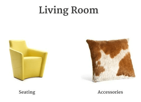
So you may want your living room page to look like this:
Once you are going to use a sub-category, you will find you can’t put the sub-category in your main category page directly in the normal way for your Shopify store no matter what free Shopify theme you are using.
Very frustrated right? calm down it is not only you got this issue, but there are also a lot of other Shopify users who have been trapped in here for a long time before.
Today I will share with you how to achieve this via a trick and easy way.
Before going to more details, you need to have some basic Shopify coding knowledge, otherwise please ask a Shopify developer or freelancer to help you. please do not try this if you do not know what you are doing exactly.
In this article
- Create a new Shopify page template
- Select your template code
- Create a page to show your category
- Create a menu to control your sub-category showing
Create a new Shopify page template
- From your Shopify admin, go to Online Store > Themes.
- Find the theme you want to edit, and then click Actions > Edit code.
- In the Templates directory, click Add a new template.
- Create a new template for page called list-cats.
- Delete the existing code in your new
page.list-catsfile. Find your theme code(this article we take Debut theme as an example) below and copy and paste the code in yourpage.list-cats file. - Click Save.
in case you don’t know how to do the above steps. please follow this video:
Select your template code
this part code depends on which free Shopify default theme template you are going to use, please click the related theme button then copy and paste the codes in your page.list-cats file:
1) Boundless
{% comment %}
 Featuring collections on a page using a menu
 https://shopify-dev.com/tutorials/feature-a-subset-of-collections-on-a-page
{% endcomment %}

{%- assign grid_item_width = 'small--one-half medium--one-third large-up--one-quarter' -%}
{%- case linklists[page.handle].links.size -%}
{%- when 2 -%}
 {%- assign grid_item_width = 'medium-up--one-half' -%}
{%- when 3 -%}
 {%- assign grid_item_width = 'small--one-half medium-up--one-third' %}
{%- else -%}
 {%- assign grid_item_width = 'small--one-half medium--one-third large-up--one-quarter' %}
{%- endcase -%}

<div class="page-width page-container">
  <header>
    <h1>{{ page.title }}</h1>
  </header>
  <div class="rte rte--indented-images">
    {{ page.content }}
  </div>

  <div class="grid grid--no-gutters collection-grid">
    {%- for link in linklists[page.handle].links -%}
      {%- if link.type == 'collection_link' -%}
        {%- assign featured = link.object.handle -%}
        {%- include 'collection-grid-item', collection: collections[featured] -%}
      {%- endif -%}
    {%- endfor -%}
  </div>
</div>
2) Brooklyn
{% comment %}
 Featuring collections on a page using a menu
 https://shopify-dev.com/tutorials/feature-a-subset-of-collections-on-a-page
{% endcomment %}

{%- assign collection_count = 0 -%}
{%- assign isEmpty = true -%}
{%- for link in linklists[page.handle].links -%}
 {%- if link.type == 'collection_link' -%}
 {%- assign collection_count = collection_count | plus: 1 -%}
 {%- endif -%}
{%- endfor -%}

{%- assign collection_index = 0 -%}
{%- assign divisible_by_three = collection_count | modulo: 3 -%}
{%- assign divisible_by_two = collection_count | modulo: 2 -%}

<div class="grid">
 <div class="grid__item large--five-sixths push--large--one-twelfth">

   <header class="section-header text-center">
     <h1>{{ page.title }}</h1>
     <hr class="hr--small">
   </header>

   <div class="grid">
     <div class="grid__item large--four-fifths push--large--one-tenth">
       <div class="rte rte--nomargin rte--indented-images">
         {{ page.content }}
       </div>
     </div>
   </div>

 </div>
</div>

<div class="grid collection-grid">
 {%- for link in linklists[page.handle].links -%}
   {%- if link.type == 'collection_link' -%}
     {%- assign collection = collections[link.object.handle] -%}
     {%- assign collection_index = collection_index | plus: 1 -%}
     {%- assign collection_handle = collection.handle -%}
     {% include 'collection-grid-collage' %}
   {%- endif -%}
 {%- endfor -%}
</div>
3) Debut
{% comment %}
 Featuring collections on a page using a menu
 https://shopify-dev.com/tutorials/feature-a-subset-of-collections-on-a-page
{% endcomment %}

<div class="page-width">
 <div class="grid">
   <div class="grid__item medium-up--five-sixths medium-up--push-one-twelfth">
     <div class="section-header text-center">
       <h1>{{ page.title }}</h1>
     </div>

     <div class="rte">
       {{ page.content }}
     </div>
   </div>
 </div>

 <ul class="grid grid--uniform">

   {%- assign grid_item_width = 'small--one-half medium-up--one-third' -%}
   {%- assign image_size = '350x' -%}

   {%- for link in linklists[page.handle].links -%}
     {%- if link.type == 'collection_link' -%}
       {%- assign collection = collections[link.object.handle] -%}
       <li class="grid__item {{ grid_item_width }}">
         {% include 'collection-grid-item', collection_image_size: image_size %}
       </li>
     {%- endif -%}
   {%- endfor -%}

 </ul>
</div>
4) Minimal
{% comment %}
 Featuring collections on a page using a menu
 https://shopify-dev.com/tutorials/feature-a-subset-of-collections-on-a-page
{% endcomment %}

<div class="grid">

 <div class="grid__item post-large--two-thirds push--post-large--one-sixth">

   <div class="section-header">
     <h1 class="section-header--title">{{ page.title }}</h1>
   </div>

   <div class="rte">
     {{ page.content }}
   </div>

 </div>

</div>

{%- assign collection_item_width = 'medium-down--one-half post-large--one-third' -%}
{%- assign collection_width = 410 -%}

<div class="grid-uniform">

 {%- for link in linklists[page.handle].links -%}
   {%- if link.type == 'collection_link' -%}
     {%- assign featured = link.object.handle -%}
     <div class="grid__item {{collection_item_width}} text-center">
       {% include 'collection-grid-item' with collection_width: collection_width %}
     </div>
   {%- endif -%}
 {%- endfor -%}
</div>
5) Narrative
{% comment %}
 Featuring collections on a page using a menu
 https://shopify-dev.com/tutorials/feature-a-subset-of-collections-on-a-page
{% endcomment %}

<div class="page-width">
 <header class="section-header text-center">
   <h1 class="section-header__title h2">{{ page.title }}</h1>
 </header>
 <div class="grid">
   <div class="grid__item medium-up--four-fifths medium-up--push-one-tenth">
     <div class="rte">
       {{ page.content }}
     </div>
   </div>
 </div>

 <div class="list-collections-template" data-section-id="list-collections-template" data-section-type="list-collections-template">
   {%- assign desktopColumns = '3' -%}
   {%- assign mobileColumns = '1' -%}

   {%- capture gridClasses -%}
     {% if desktopColumns == '3' %}medium-up--one-third {% else %}medium-up--one-half {% endif %}
     {% if mobileColumns == '2' %}small--one-half {% endif %}
   {%- endcapture -%}

   {% comment %}
     For Collage style replace grid_style = 'grid' with grid_style = 'collage' below
   {% endcomment %}

   {%- assign grid_style = 'grid' -%}

   <div class="card-list grid" data-desktop-columns="{{ desktopColumns }}" data-mobile-columns="{{ mobileColumns }}" data-grid-style="{{ grid_style }}">
     <div class="card-list__column grid grid__item {{ gridClasses }}">

       {%- for link in linklists[page.handle].links -%}
         {%- if link.type == 'collection_link' -%}
           {%- assign collection = collections[link.object.handle] -%}
           {% include 'collection-card', collection: collection, width: desktopColumns, grid_style: grid_style %}
         {%- endif -%}
       {%- endfor -%}

     </div>
   </div>
 </div>
</div>
6) Simple
{% comment %}
 Featuring collections on a page using a menu
 https://shopify-dev.com/tutorials/feature-a-subset-of-collections-on-a-page
{% endcomment %}

<h1 class="small--text-center">{{ page.title }}</h1>

<div class="rte">
 {{ page.content }}
</div>

{%- assign grid_item_width = 'small--one-half medium-up--one-third' -%}

<div class="grid grid--uniform">
 {%- for link in linklists[page.handle].links -%}
   {%- if link.type == 'collection_link' -%}
     {% assign collection = collections[link.object.handle] %}
     <div class="grid__item {{ grid_item_width }}">
       {% include 'collection-grid-item' %}
     </div>
   {%- endif -%}
 {%- endfor -%}
</div>
7) Venture
{% comment %}
 Featuring collections on a page using a menu
 https://shopify-dev.com/tutorials/feature-a-subset-of-collections-on-a-page
{% endcomment %}

<div class="page-width">
 <h1 class="small--text-center">{{ page.title }}</h1>
 <div class="content-block">
   <div class="rte rte--indented-images">
     {{ page.content }}
   </div>
 </div>

 {%- assign collection_count = 0 -%}

 {%- for link in linklists[page.handle].links -%}
   {%- if link.type == 'collection_link' -%}
     {%- assign collection_count = collection_count | plus: 1 -%}
   {%- endif -%}
 {%- endfor -%}

 {% assign number_rows = 1 %}

 {% case collection_count %}
   {% when 1 %}
     {% assign grid_item_width = 'medium-up--one-half' %}
     {% assign height = 450 %}
   {% when 2 %}
     {% assign grid_item_width = 'medium-up--one-half' %}
     {% assign height = 450 %}
   {% when 3 %}
     {% assign grid_item_width = 'medium-up--one-third' %}
     {% assign height = 330 %}
   {% when 4 %}
     {% assign grid_item_width = 'medium-up--one-quarter' %}
     {% assign height = 235 %}
   {% else %}
     {% assign grid_item_width = 'medium-up--one-third' %}
     {% assign height = 330 %}
     {% assign number_rows = collection_count | divided_by: 3.0 | ceil %}
 {% endcase %}

 <div class="grid grid--no-gutters grid--uniform collection" data-number-rows="{{ number_rows }}">
   {% assign row_number = 1 %}
   {%- for link in linklists[page.handle].links -%}
     {%- if link.type == 'collection_link' -%}
       {%- assign featured_collection = collections[link.object.handle] -%}
       {% if collection_count > 4 and forloop.index > 3 %}
         {% assign row_number = forloop.index | divided_by: 3.0 | ceil %}
       {% endif %}
       {% include 'collection-grid-item' with stretch_collection_image: false, height: height %}
     {%- endif -%}
   {%- endfor -%}
 </div>

</div>
Create a page to show your categories
- From your Shopify admin, go to Online Store > Pages.
- Click Add page.
- In the page editor, enter a Title in the text box provided. You must use the same title for the menu that you’ll create in the upcoming steps, or you must keep the page’s handle name is the same with the menu handle. for example in the example we set page title as ‘LIPS TITLE HERE‘ but we keep the page handle name as ‘lips‘.
- Assign your new template to the page by selecting list-cats from the Theme template drop-down menu in the Online store section.
- Click Save.
Follow the below video for all steps:
Create a menu to control your sub-category showing
- From your Shopify admin, go to Online Store > Navigation.
- Click the Add menu button.
- Give your menu the same Title as the title that you gave the page that will feature your category or collection. if not the same Title , does not matter, you must keep the menu handle name same with page’s hanle name. For example, in the page we created has the handle ‘lips‘, then give the menu handle name as ‘lips‘.
- Add links to your menu for each collection or category that you want to feature by clicking Add menu item. Choose collections from your store by clicking on Collections in the drop-down menu for the Link text box. Link to your collections in this way, instead of adding a URL to the text box.
- Click Save menu.
Follow the video for all the steps:


Recent Comments