A quick way to find what causes your page horizontal scrolling on mobile
When you develop or modify your Shopify responsive front-end page, as you put more and more elements in, your CSS file constructs and the content will be more complex.
Don’t know when suddenly you maybe find your page does not work well on the mobile because it will make the mobile page has a horizontal scroll. It will be a bad user experience for your mobile users.
How to fix it? Normally due to some elements’ size over the window size, we know this, but how to find the culprit one from your tons of elements. Of course, you can write javascript snippet codes to find anyone which size is over the screen size.
Is there any easy and quick way to find the culprit? the answer is YES.
You can do as below steps:
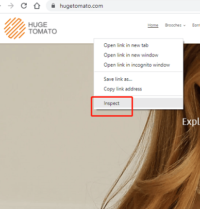
Step1 – Open your page from your Chrome browser
Step2 – Right-click on your page, select Inspector from the popup menu
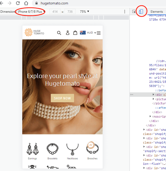
Step3 – Switch to Mobile view mode
click the mobile switch button switch to Mobile view mode and select iPhone 6/7/8 plus
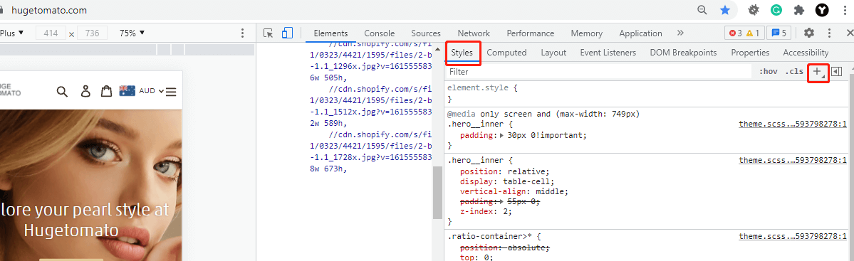
Step4 – Add a New Style Rule into Styles context
Click + button in the Style Tab
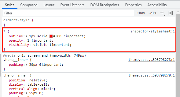
Step5 – Change style name to * and copy the following CSS code in
* {
    outline: 1px solid #f00 !important;
    opacity: 1 !important;
    visibility: visible !important;
}
Once done your CSS will look like this:
Step6 – Now you can see all the elements with a red outline

Now your culprit will appear immediately.
Good luck, hope this can help you out.


Recent Comments